Increase Conversions on Your Website in 5 Seconds
If you don’t get to the point in 5 seconds or less, you may lose a lot of potential business. The death of any website is ambiguity. Founders, designers, and marketers, more often than not, make the mistake of creating sites that are too vague. If your site isn’t as transparent as it can be, a simple test can help you uncover the fix and significantly improve your key metrics.
Most visitors won’t read your website. Most readers will skim (if you’re lucky). So, it’s no surprise that, if you don’t give them a reason to stay within the first few seconds, they’ll hit the back button. Let’s look at how we can make those seconds count.
Your website’s job is to be clear.
Most founders, designers, and marketers know that their site’s marketing objective is to convince their visitors to take action (e.g. sign up, subscribe, contact you, purchase, etc.). But how they go about doing this is often where they get it wrong. If you’re selling a product or service online, your job is to clearly answer 3 questions for your new visitors:
1. Who are you?
2. What product or service do you provide?
3. Why should I care?
Nailing all three points is a blog post of its own, but you should NEVER confuse visitors about the product or service you provide. It sounds obvious, but you’d be surprised how many companies still manage to screw this up. People won’t take action unless they know what’s in it for them. And they won’t know what’s in it for them when what you’re offering is unclear. And for your offering to be clear, it has to make sense to all members of your potential audiences.
Here are a few examples of what I mean.
Look at the following screenshots and ask yourself this: What product or service do they provide?
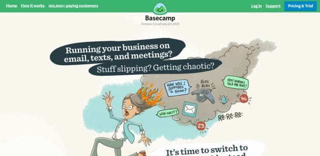
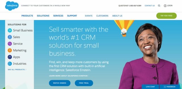

If it’s not immediately clear, that’s a problem because not everyone will be patient enough to learn about you further down, “below the fold” (where the answer the viewer may be looking for is).
My question to you is this: are you guilty of the same mistake?
The 5-Second Test
The 5-second test is a simple technique for capturing a visitor’s first impressions by simulating their snap judgment of your site.
A 2008 study on internet behavior found that 52% of all site visits were shorter than 10 seconds. Even more surprising, 25% of page views end in 4 seconds or less.
The goal of this test is to show someone a page or design (either live or work-in-progress) and see if they understand what the site is about in just 5 seconds. So run the test, and you’ll have a sample on how your site is doing in the real world.
Sounds easy, right?
There are several benefits to running this test:
- it’s incredibly easy to run
- you’ll get qualitative results back within an hour (or less)
- you can conduct this in person or online
- you don’t need special training
- you don’t need targeted users (although, sometimes they can help) and
- you can run this for free (if you recruit your own testers) or under 25 bucks per test (if you use an online service to recruit testers—I cover this below).
Here’s how you can run your own tests:
- Set up your test. If you’re doing this offline, open up your site in your browser or load your mock-up with the page above the fold (the part of a webpage that is visible without scrolling). If you’re doing this online (I personally use UsabilityHub.com), just upload your screenshot and set up the follow-up questions you’d like to ask.
- Find people who have not visited your site (e.g. friends, a stranger on the street / at the coffee shop, Reddit, Facebook Groups you belong to, etc.). Ask them to help you review a design you’re working on. I like talking to at least 15 to 25 people because, once you’ve collected data from that many people, you’ll start seeing trends. If you’re using UsabilityHub or something similar, just send your testers the link (or buy credits to get your full results back in ~5 minutes).
- Show testers your site for 5 seconds. If you’re running this offline, tell them you’re going to show them a webpage for 5 seconds, take it away, and then ask your follow-up questions. People sometimes get nervous when strangers survey them, so make sure they know you’re testing the site, not them.
- Review your results. You’ll want to take some notes to notice any trends and patterns. I’ve included some of my own results in a case study below.
I hope this post inspires you to start testing your landing pages. Ran a test and still have questions? Saw a website that was completely confusing? Tell me about it in the comments!